In version 1.1.2, GROVV added two players. Player 2 is called Steinweiss, named after Alex Steinweiss, the father of the vinyl record cover. Vinyl covers, unlike the records themselves, make no sound, but they are indeed the earliest reason we pause, linger, and pick up a record to look at it. I hope this story helps you understand the warmth within this player.

Our encounter with a record often happens a few seconds before the music.
Fingers move across the record shelf, cardboard rubs, covers flip past one after another. Suddenly, a color, a stranger's face, or a line of type so beautiful it seems almost stubborn makes the motion stop. We don't yet know the music inside, but we are already willing to pull it out and flip it over to see the back.
That's how covers work. They make no sound, yet they can make you stay.
Today, this is so natural it almost doesn't warrant questioning. But before record covers became an art form, a young man first lost patience with those dull packages. His name was Alex Steinweiss.
The melodies inside the record came from the hands of musicians; he arranged for these sounds to meet the listener.
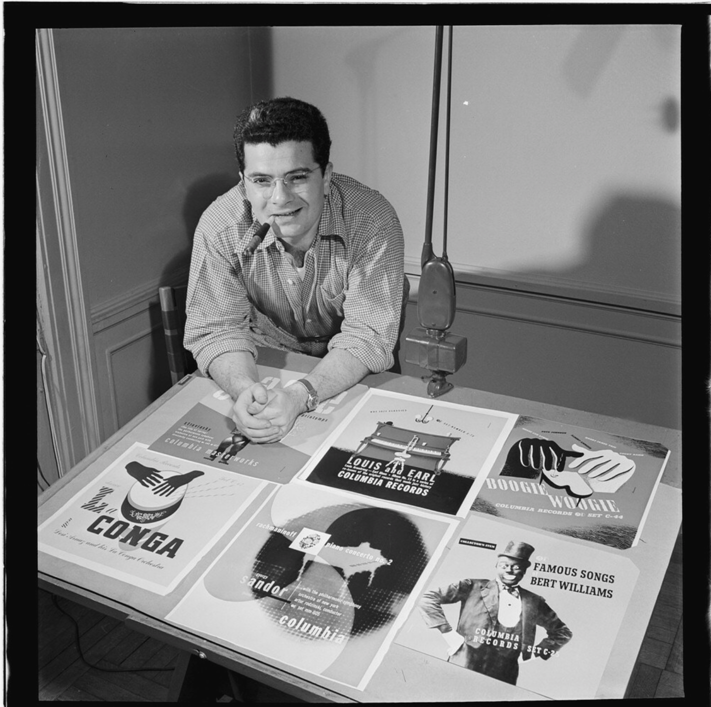
A young man who loved type and music
In 1917, Steinweiss was born in Brooklyn, New York. His father made shoes, his mother sewed. Music was also part of this family's life.
His later turn to design was inseparable from the influence of his high school teacher, Leon Friend. At Abraham Lincoln High School, Friend introduced students to European modern graphic design. Posters, typography, and graphics thus entered the young man's field of vision. Steinweiss later received a scholarship to study at Parsons School of Design, and after graduating worked for Austrian designer Joseph Binder.
In the story of music covers, this period of education deserves a little more time.
It's easy to understand a cover as a painting: paint it beautifully, put it outside the record, and the job is done. Graphic design considers more—how to make a person see, how to make the gaze move in order, how to leave a memory in a very short time.
Text also has its own posture. It can stand very steadily, or it can wobble; it can be like an announcement on stage, or like a sudden accent in a piece of music. Before the title is understood, it has already conveyed a certain emotion through its shape.
Steinweiss's later record covers would continually prove this point.
That music was once housed in silent cardboard
In 1939, Steinweiss joined Columbia Records.
The common record packaging at the time was far from today's scene in record stores. Many packages used plain paper or cardboard, providing information such as title and performers; multiple records were often bound in book-like albums. Occasionally, the original packaging had patterns, but creating a cover specifically for a set of music with a distinct visual personality was far from an industry convention.
Here we need to set the time right: what he faced was mainly 78 rpm shellac records. The later widespread vinyl LP would not appear for several more years.
The story of vinyl covers thus begins with its predecessor generation of records.
Steinweiss proposed to the company that these packages should be given more attractive imagery. This suggestion also brought up issues of plate-making, printing, and cost. In interviews he later gave, these production difficulties occupied a quite concrete place.
Looking back, we might think his suggestion was almost common sense.
But common sense is often just the name given after success. Before it happens, it may just be an expenditure in the budget that has not yet been proven useful.
He moved a theater outside the record
Around 1940, Steinweiss designed the cover for Smash Song Hits by Rodgers & Hart, which would later be repeatedly mentioned: a theater marquee-style sign became the main subject, with the title on the sign, as if a performance were extending an invitation to people on the street.
This image has a power that makes you want to come closer.
The theater sign originally belonged to public space. It faced pedestrians and told them: here is a performance worth walking into. Steinweiss put this language into record packaging, as if returning the act of "entering" to the record buyer.
Even if one knows nothing about the performers or tracks, the listener can find an entrance from this cover. A pause that begins with curiosity may turn into a long-lasting love.
In this sense, the cover is like a hand extended by the music.
However, to write this as "before this there were no record covers in the world, and he alone suddenly invented them" is still too simplistic. Design historian Steven Heller specifically reminded us that this absolute statement needs correction: Steinweiss's important contribution was bringing the poster language of typography and illustration into record packaging.
Calling him a "pioneer of modern record cover design" is already enough to convey the weight of this work, and also leaves due place for earlier packaging design.
He left room for imagination in sound
Steinweiss's covers often have a striking main subject, clear typographic relationships, and strong yet restrained colors. In his images, music can acquire expression through symbols, graphics, and text. The handwritten type later called "Steinweiss Scrawl" became his distinctive personal mark.[Reference: The One Club Hall of Fame materials] Looking at these works, what I like most is the room they leave for the viewer.
Between a good cover and the music, there always needs to be a little distance. If the image has already prescribed everything for the listener, the music instead loses its freedom.
A block of color can evoke temperature, a shape can bring a sense of power. They gently push feeling in a certain direction; as for what season it is, what kind of melody, everyone can have their own understanding.
And precisely because of this, a cover changes with each listening. When we first get it, we only see colors and text. Years later, the same image may already carry a piece of life: a certain room, a certain person, or a period of days one doesn't want to explain.
The image hasn't changed. We have put our own time into it.
A piece of cardboard also needs careful design
In 1948, Columbia introduced the long-playing microgroove record, and the LP began to change the way people listened to recordings. [Reference: Smithsonian Folkways record technology history booklet]
The new format also posed real packaging problems for Steinweiss. He participated in developing the cardboard record sleeve for the LP, a structure that became an important foundation for later record packaging.
This is a part of his story easily hidden by beautiful images.
We praise the colors of a cover, praise the composition, but rarely praise its ability to properly hold a record. The cardboard must bear weight, the opening must allow for removal and insertion, and the packaging must both protect what's inside and make people willing to approach it.
The life of a cover work lies in these concrete uses. It will be picked up, pulled out, put back, and will leave traces through repeated handling.
For collectors, viewing and using are always connected. We pick up the cover, hold the edges, slide out the inner sleeve from the side. These actions form the prelude to listening. Before the music begins, the hand has already entered its rhythm.
Later, record covers had their own world
Steinweiss's work gradually extended beyond Columbia. He created for Decca, London, Everest, and other companies; his works spanned classical, jazz, and popular music, and also involved logos, advertising, and other packaging design.
And the world of record covers grew larger and larger.
It can be quiet or provocative; it can let musicians appear, or make them disappear entirely. Sometimes we remember the image first, and only much later truly understand the music inside. Sometimes it's the opposite: the music has accompanied us for years, and one day we suddenly see the details on the cover.
The later history of covers was written jointly by many designers, photographers, illustrators, and musicians. Each generation brought its own aesthetics, technology, and era experience into this square space, giving it an increasingly rich expression.
That relationship Steinweiss helped establish also continued: the packaging participated in the work. Even after the record has been taken out, the cover left at hand is still worth viewing, still accompanying the listening.
The designer left, but the cover remains in hand
In the later part of his career, Steinweiss gradually withdrew from commercial graphic design and devoted more energy to ceramics and painting. In 2011, he died at the age of 94.
What can a designer leave behind?
Sometimes, it's a named work in a museum. Sometimes, it's a kind of everyday familiarity so deep that people forget it once had to be created.
Today, we stand records next to speakers, place covers facing outward in record shelves, or decide to listen to a completely unfamiliar album simply because we like the look of a cover. These tiny actions all keep the cover participating in the music.
I am willing to understand Steinweiss's contribution as a seriousness about "taking a look."
He gave that look weight.
The record will stop spinning, one side of music will eventually come to an end. But the cover is still there, preserving the shape after the music temporarily leaves. Until next time, when we take it off the shelf, it will again, before the sound, recognize us.
-
References
-
AIGA Eye on Design: educational background and early work
[How Columbia Records’ 23-year-old Art Director Alex Steinweiss Changed the Way We Buy Music](https://eyeondesign.aiga.org/how-columbia-records-23-year-old-art-director-alex-steinweiss-changed-the-way-we-buy-music/)
-
Eye: interview with Steven Heller, including Steinweiss's own recollections of packaging design
[Reputations: Alex Steinweiss](https://eyemagazine.com/feature/article/reputations-alex-steinweiss)
-
The One Club: ADC Hall of Fame profile
[Alex Steinweiss](https://www.oneclub.org/adc-hall-of-fame/-bio/alex-steinweiss/)
-
TASCHEN: portfolio and content introduction
[Alex Steinweiss. The Inventor of the Modern Album Cover](https://www.taschen.com/en/limited-editions/music/05039/)
-
Steven Heller: qualification of the "first record cover designer" claim
[25 Typographers, PDF](https://design.sva.edu/heller/25_typographers.pdf)
-
Design Week: cover and LP cardboard packaging design
[The inventor of the album cover](https://www.designweek.co.uk/issues/march-2011-online/the-inventor-of-the-album-cover/)
-
Smithsonian Folkways: historical materials on recording media development
[Record booklet, PDF](https://folkways-media.si.edu/docs/folkways/artwork/FW03887.pdf)
-
The Philadelphia Inquirer: obituary from The New York Times News Service
[Alex Steinweiss | Album-cover designer, 94](https://www.inquirer.com/philly/obituaries/20110723_Alex_Steinweiss___Album-cover_designer__94.html)